World Pet Express Website
HTML
SCSS
jQuery
JavaScript
Design
Illustrations
Year: 2019

An online pet pharmacy website re-design. The site already had traffic and sales but needed a face-lift to make sure clients were visiting a modern, responsive, clean and trust-worthy looking website. The redesign helps boost sales by making it friendlier, easier to use, and faster to load.
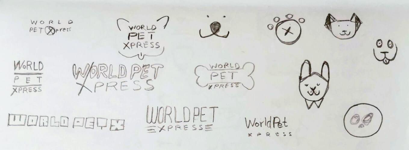
The re-design also meant a re-brand so I started by sketching many ideas and I set my mind on one, I launched Adobe Illustrator (XD & Figma were other options too) to put my ideas onto a beautiful design. The re-design needed to be somewhat similar to the older one keeping similar elements. Colors were not something we focused on since we felt we didn't need one color for this brand but could apply it based on the medium of advertising.
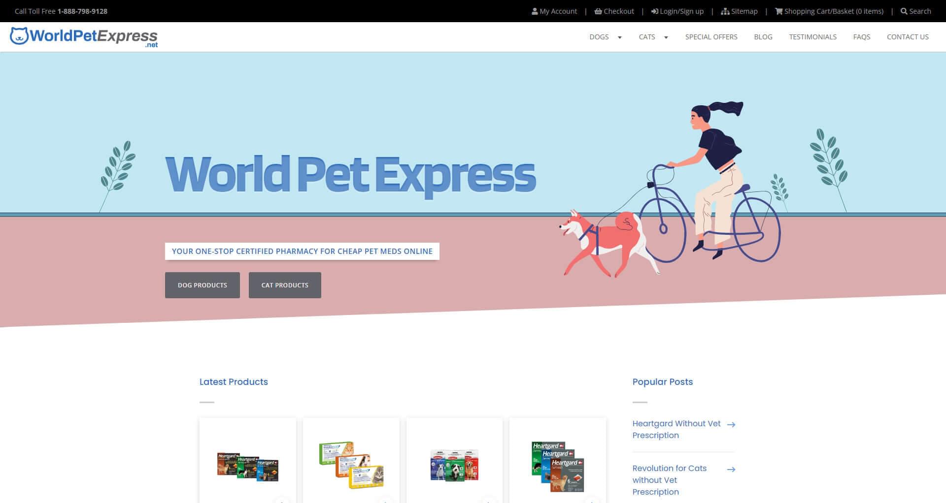
For the website, my manager mentioned they wanted things done in a timely manner which meant instead of creating many new things, the focus was to just enhance what is already there so I took some time to consider the target audience and came up with a fun and exciting animated header that has two main calls to action giving the users the 2 main choices we had for pets. This was a mix of pre-planning and designing in code since I wanted to test out the animations to make sure they aren't too obtrusive and also will look good as a static image if it's disabled.
With this site, I kept some of the original colors so existing users wouldn't be overwhelmed by a big sudden change. I kept lots of white space around the content to give the feeling of being invited and welcomed but also used simple, slick animations for the links to give the users a feeling that the site is fast and responsive. For the bottom section of the home page, I went with isometric style illustrations to tie the top illustration of the site to keep a consistent theme throughout the site.
The product sections had 2 different designs as a way to show the client different options but they actually liked both and asked to keep both versions since they wanted variety on the site. Some sections were unfinished since parts of this was designed in code and needed content from the marketing team but by then the project scope had changed significantly and was not continued.
I coded the site using modern techniques with Flexbox and CSS Grids making sure some elements are positioned correctly on desktop and mobile (sections under best sellers). The mobile view of the had the image before text even though on desktop the info was presented where it alternated between image first or last. I did this with ordering in CSS to allow a consistent reading experince for mobile.
Animation played a big role to the website's header to give the feeling of being dynamic and unique. I used CSS keyframe animations for most of it but also Javascript for some of the mouse based position interactions of the girl on the bicycle with the dog.
The project taught me to consider how the navigation was to be re-designed for maximum ease of use and how illustrations can play a big role in making the site feel friendlier.
Some of the animations had to be adjusted for desktop and mobile to make sure it worked correctly with proper sizing.
The website had a beautiful re-design of an 8+ year old website that is modern and fits with today's web standards and even though the front-end of the site was nearly finished, the owners took a different direction which meant yet another re-design that later took close to 14+ months to complete. For me though, I had a personal template to code other websites with and had new insights for better design focusing on the user and ease of use.
Logo Design Concepts/Ideas
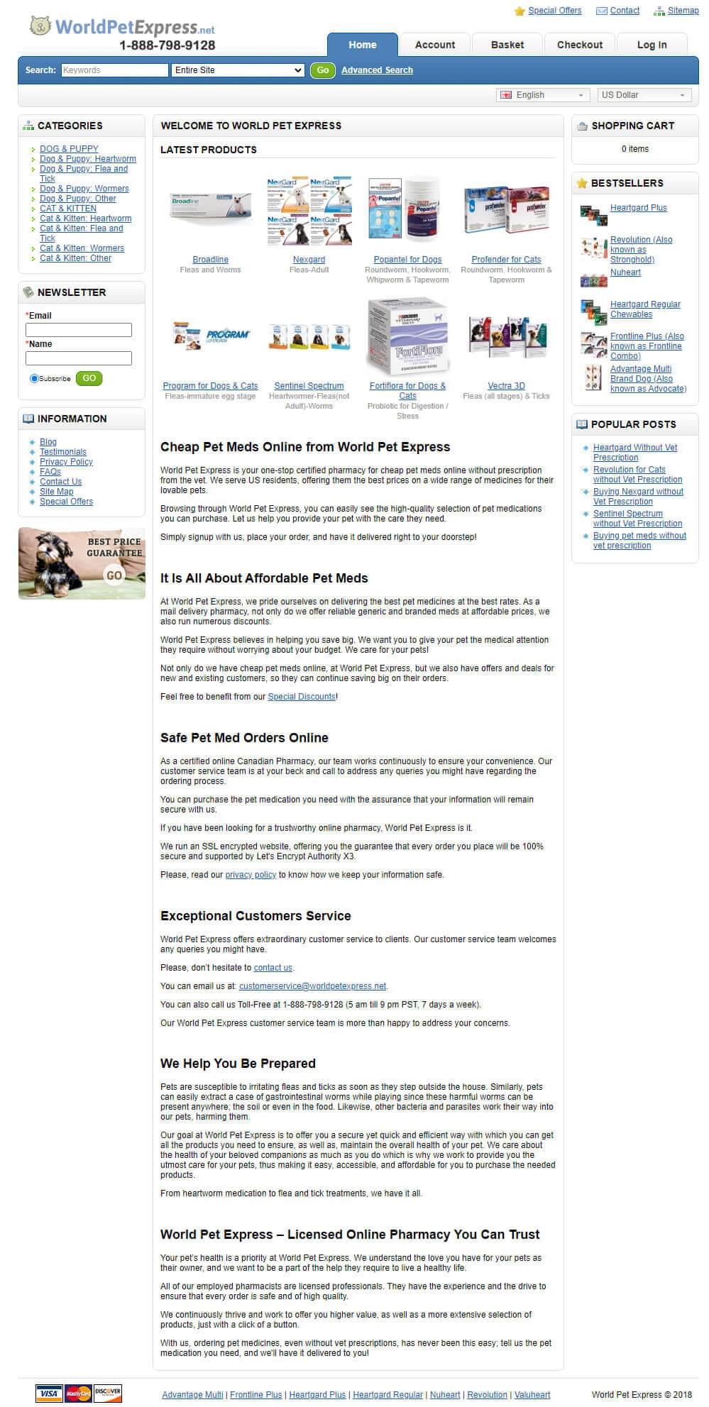
Old Logo Design

Full Website Screenshot

Old Website Screenshot
