Canada Pharmacy Website
HTML
SCSS
jQuery
UI
UX
Branding
Design
Website Links (not all pages are linked since this is a test site now).
Home Page Shop Checkout How It Works Products Products Alt Prescriptions Video of design & prototypes in XD Video of custom checkout animationsYear: 2020

The project was to build a new brand for a new e-commerce solution for Canadians to be able to find a doctor online using tele-health solutions allowing doctors to prescribe medications that users can purchase from this website (or other sources) after a brief process (signup, filling info, uploading docs such as the prescription, and adding products to cart for check out).
I had (somewhat) total freedom to come up with a design that is friendly to the healthcare sector which to me meant a clean and clear layout with a calm and trusty color palette. I started to do some research based on previous designs that were approved and after some logo sketches and a few revisions, approval was met. I emphasized the pharmacy feel making CP in the shape of a pill (I knew these concepts would get a higher approval rate for my manager/bosses). Then my manager trusted to give me total control over the next part (to design & develop the site) and I chose to start research for the UX starting with a scenario of a user going to the website and choosing a product and going through the entire signup/purchase process. I visited a few successful e-commerce and telehealth websites for inspiration such as BestBuy and Amazon and tailored this process towards my project creating low fidelity wireframes for many pages. I refined the process after some feedback and once this was approved, I used Adobe XD to create the style guide with colors, fonts, and components and other UI elements for the site's design.
I made sure the navigation was clear and presented lots of options in a concisely grouped manor (using mega navigation) so users can get to the info they need faster which leads to higher sales numbers. The next part was the virtual health & prescriptions section since they wanted to promote this on the site and also added more information for SEO purposes to build organic traffic to the site once it went live.
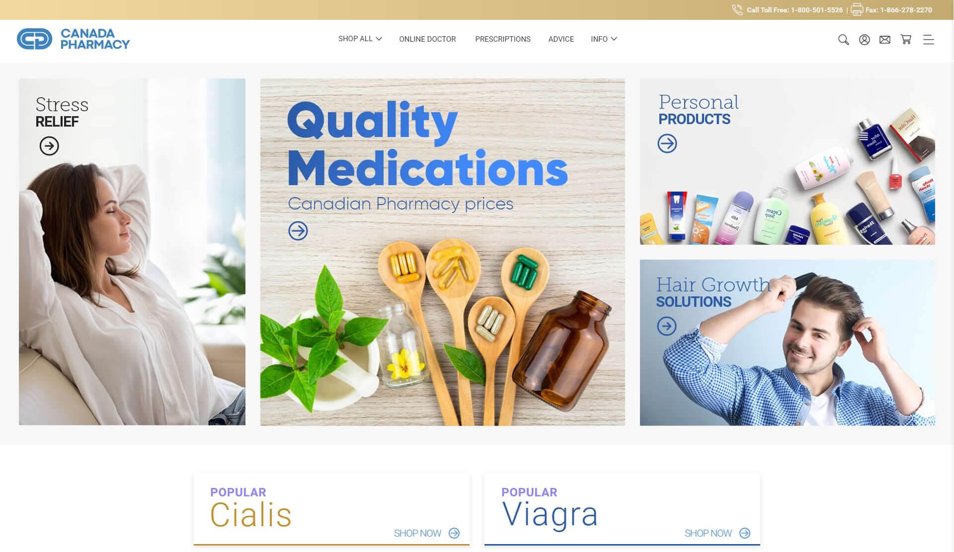
The design went through a couple of minor iterations but the manager and owners loved the idea of the multiple banners at the top of the home page. This allowed for multiple points of sale that would hopefully appeal to most users and since this part was to be dynamic, it allowed lots of flexibility.
Now I was able to design the rest of the pages using the home page as a template with minor iterations and optimizations along the way. I tested this with a couple of people using the live XD prototype to help me understand if I needed to make things simpler/easier to use especially in the user dashboard section. Some of the feedback was implemented to further enhance this part of the site.
I presented some sections with slight modifications to give my manger and owners some options (such as shadows behind products in a white box vs products with no box or border. Overall, I kept the design to be clean with some colors/accents to bring out important details or call to action buttons. The single product page had lots of white space around the product photos & price to make the user does not feel pressured but invited to try this item making sure the main Add to cart button stood out in this case using color to make it pop.
Generally, I like to design the mobile pages but there was a rush to get this done soon which meant once the desktop designs were approved, they wanted me to start coding the site. I tried to keep my designs with that in mind early on (as an example, all product upsell sections such as top sellers would work the same way on mobile but have only 1-2 products shown with arrows on the sides to show more products.
One thing I like to show is the frosted glass effect which I thought added a nice touch to the navbar once users scrolled. Note how it's a dark glass effect since the feedback was to show the alternative logo version in white. My personal preferences as a designer aren't always met or understood so after trying to educate the client, I accepted what is being suggested to keep the project moving.
I gained approval of the entire design and prototype and started exporting assets for code which I also did (hand code). I made sure to talk to the back-end developers so that I could make it easy for them to implement this in the backend later using .NET. For now, my focus was to make the site run fast, and be responsive and accessible. I used Gulp with Node.js (NPM) for a faster, more optimized workflow. I animated certain elements such as banners, buttons, checkout, and other features to bring an extra layer of interactivity for users with micro-interactions and visual feedback which enhances the overall shopping experience paying attention to keeping the code to a minimum.
I handed off the code to the back-end developers and we collaborated together to have them implement the dynamic parts of the site and the user dashboard/shopping cart functionality added while keeping the rest of the site functioning as it should. Only thing was to be done was SEO which I had done some parts with proper HTML tag hierarchy to get things started. I did leave out a few of the animations that I had done in the prototype to able to hand it to the back-end developers in time but would later come back to it to finalize these pieces once they had something to work on.
My main focus for the home page was to drive traffic and upsell so I opted for a design with a few smaller banners on the homepage's hero section which would hopefully tailor to different users in at least one way and below that were two of the most popular products (ones they wanted to sell the most at first).
Great research provides the least challenges. No challenges here except for implementing a well thought of mega menu (tested on mobile too).
The company had a complete website ready to launch for this new sub company for the Canadian market but sadly, the owners had a change of vision which meant a whole different project and this was not to be launched. The positive thing for me was that I designed and developed an entire brand with beautiful assets, logo, and other graphic elements as well as a fully functioning e-commerce website all by myself.
Full Website Screenshot

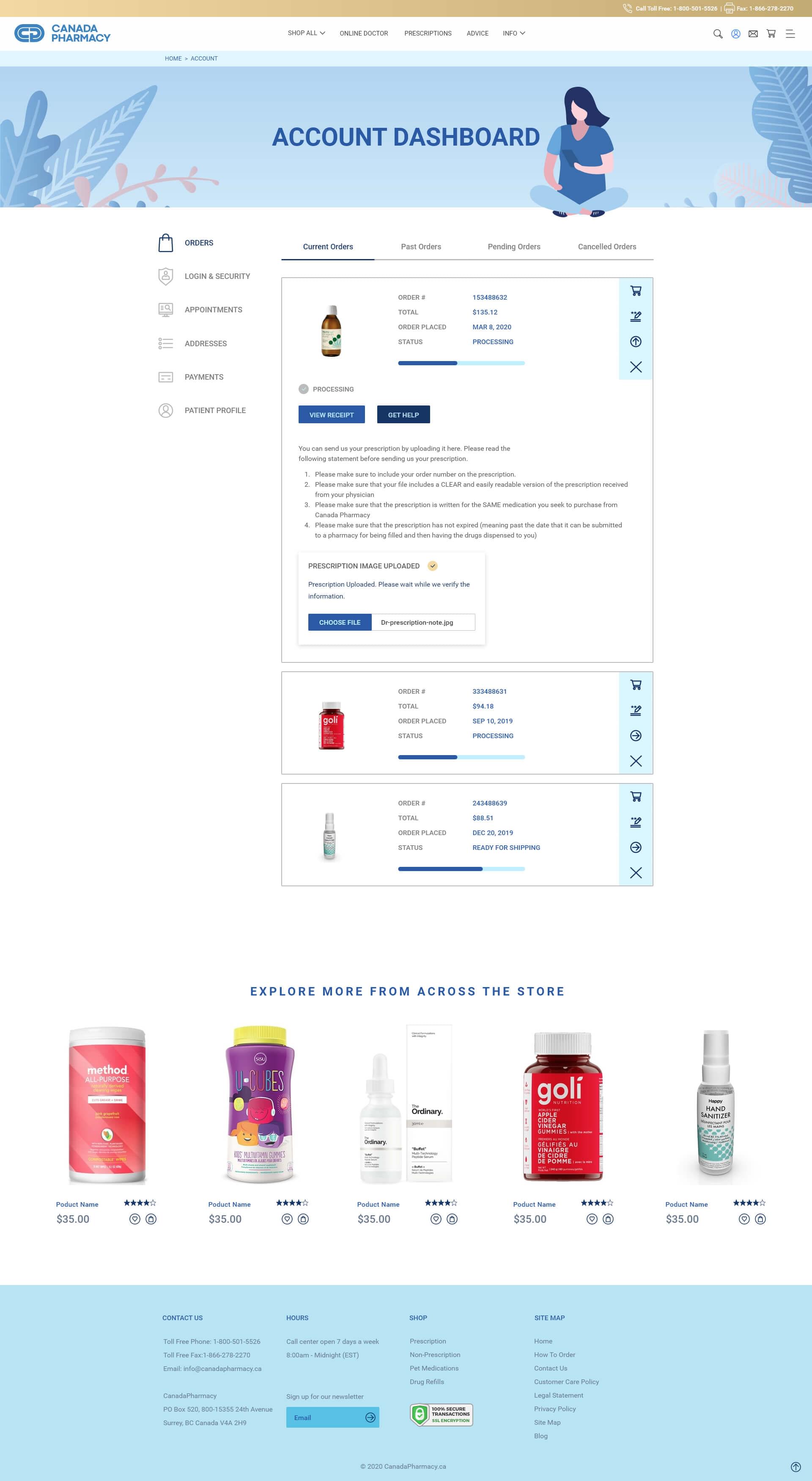
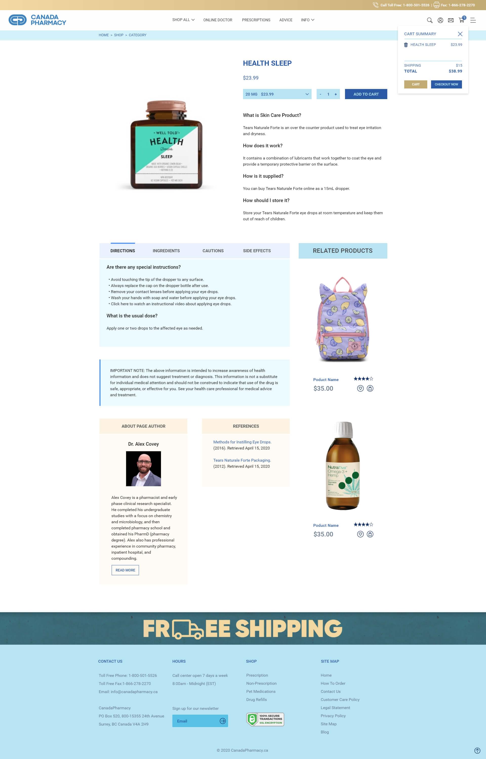
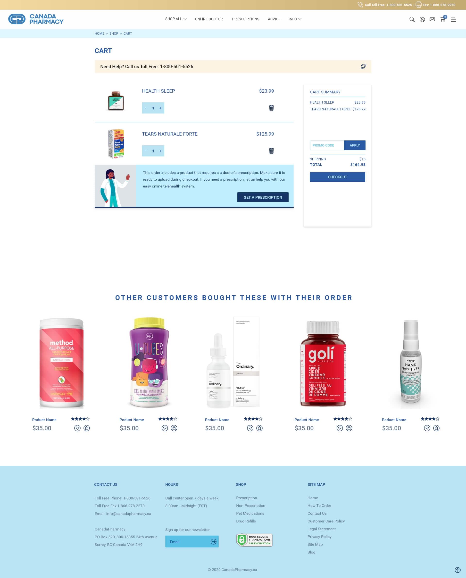
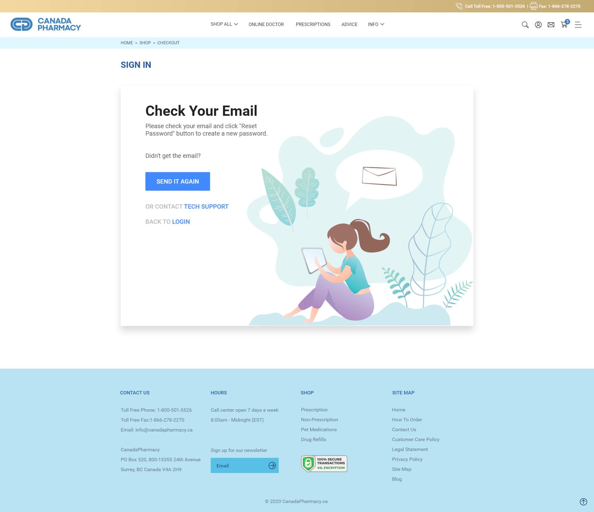
Website Product Category Screen


